There’s nothing wrong with going for it. We live in the age of 400-yard drives and par 5s in two after all. Yet these days too many tour players lay up while getting dressed. The golfers listed here, however, waited for the green to clear, took big swings and sent some worm-burners skipping through the dew. That’s OK, though. During the past 30 years on tour, more than a few lessons have been learned in building a statement-making outfit from excessive attempts at fashion glory.
WOODY AUSTIN
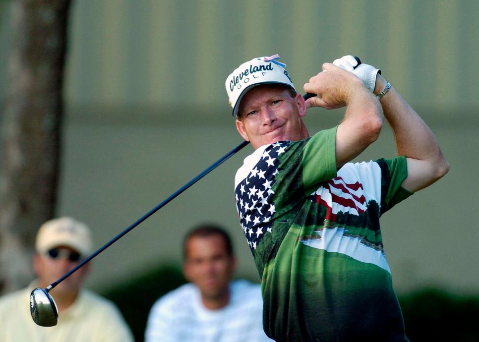
Al Messerschmidt
2004 Ford Championship
There’s nothing wrong with a patriotic golf homage, but this shirt fell short. Now if this had been a Ryder Cup, it might have been easier to embrace the excess, but you need some serious swagger to pull this off as ironic fashion. Still, we’ll give him kudos for the effort—it takes guts to wear that much sand trap across your torso.
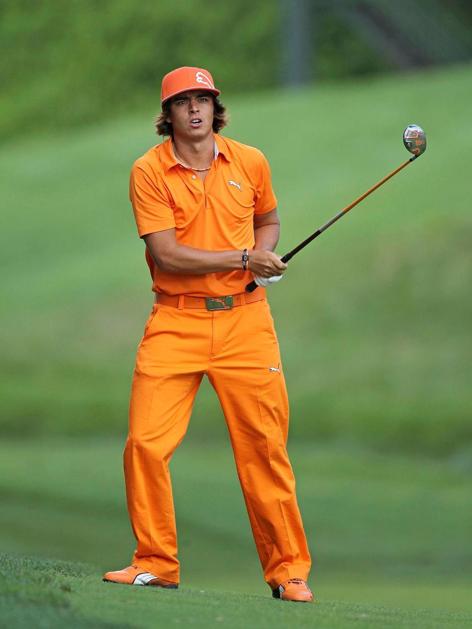
RICKIE FOWLER
Andy Lyons
2010 Memorial
It’s not a knock on Rickie’s dedication to honoring his alma mater on Sundays, but there are better ways to incorporate Oklahoma State’s flashing hue of orange than dipping your entire body in it. Navy, gray, black and whites of all shades play better in a full-kit execution. Swap everything but the pants for white or gray, and we would have a viable fit. Rickie deserves a ton of credit, though, for inspiring legions of young golfers to break outside the uniform.
DOUG SANDERS
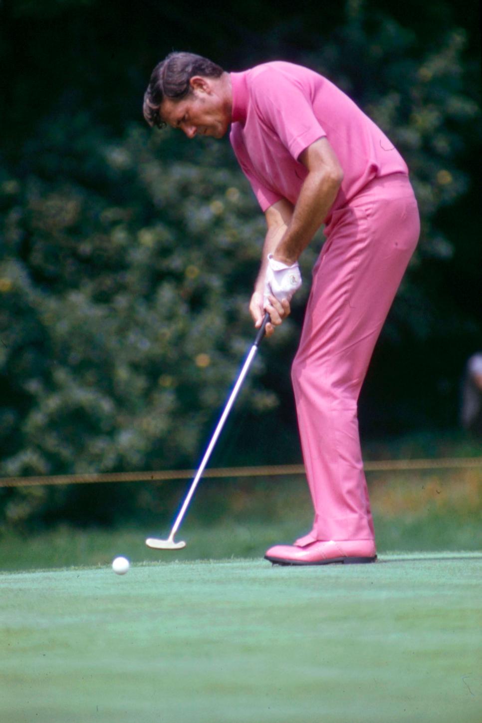
Walt Disney Television Photo Archives
1969
Here we have the king of on-course monochrome, Doug Sanders, known as “Peacock of the Fairways,” but on this day in 1969 he flamingoed himself onto this list. It’s not a knock on monochrome or pink, but if you’re going to go for it, a lighter, less vibrant hue would be easier on the eyes.
IAN POULTER
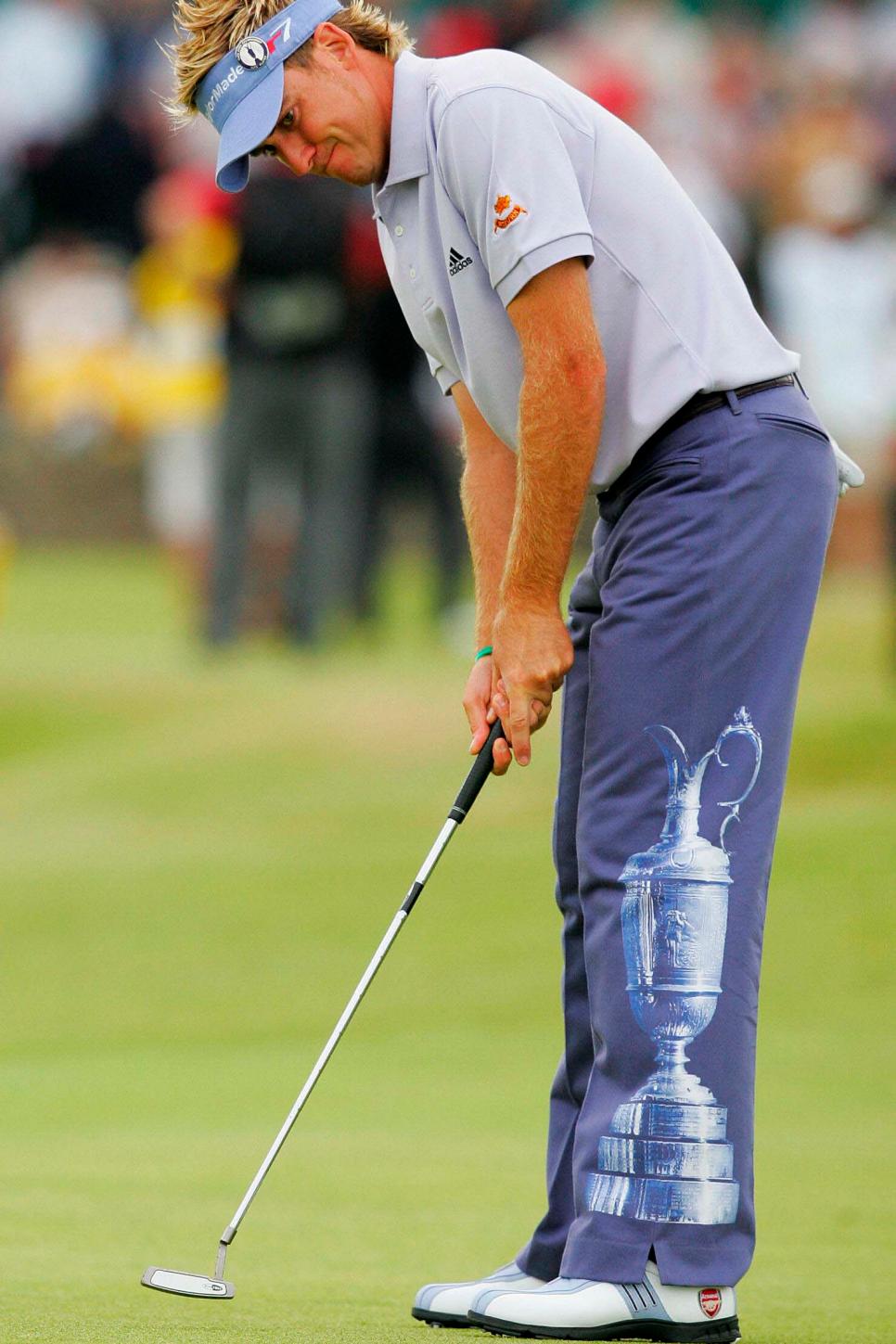
JOHN D MCHUGH
2005 Open Championship
As if you weren’t already keenly aware of how bad Poulter wants to get his hands on the claret jug, he made it extra clear with his pants of choice at the 2005 Open Championship. The non-tour visor—the younger cousin of the lid Keith Mitchell and Nancy Lopez have worn to great effect—has never played well. If I’m the jug, I’m not flattered, which might explain Poulter’s continued drought in the tournament. (He would tie for 11th this year, not counting the unofficial penalty strokes we would apply for the pants.)
RORY SABBATINI
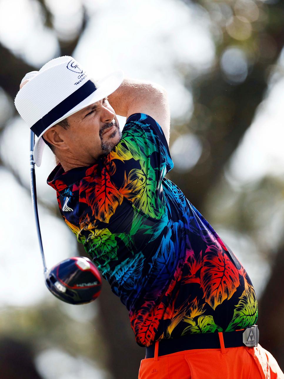
Douglas P. DeFelice
2023
This ensemble is from a perennial offender of wearable assaults on the eyes. The shirt looks like it came with a free bag of magic crystals and a bottle of SoBe juice, and Sabbatini for some reason chose a swatch of orange for his pants that’s hardly a play on the drapes above. This hat style isn’t foreign to Sabbatini, but for whatever reason, it’s where he decided to exercise a little restraint in the color department.
PAYNE STEWART
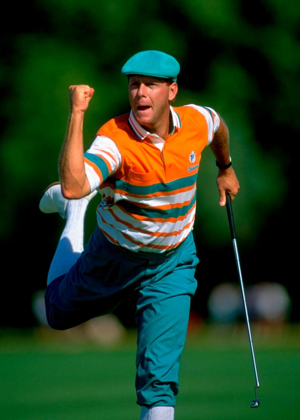
David Cannon
1991 U.S. Open
Payne Stewart could easily secure a spot on golf’s Mount Rushmore of over-the-top dressers, but nothing lent itself to Stewart’s excess more than his NFL sponsorship, which had him in team colors on the PGA Tour. At the 1991 U.S. Open in Minnesota, Stewart came out in Don Shula-core. This number just doesn’t hit when mixed with Stewart’s signature style—a uniform best kept simple. Still, we have nothing but love for Stewart’s cap and plus fours, one of the most iconic looks in golf history. This stint was a hiccup in an otherwise brilliantly stylish career. (He would go on to win that week by the way, so whatever works!)
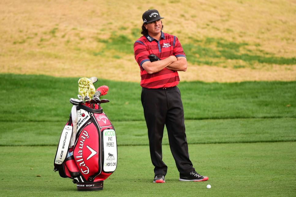
PAT PEREZ
Harry How
2016
Pat Perez’s style leans loud, like his unfiltered and entertaining opinions, but even when he tones down his look, there’s something off about his flat brim. Perez showed up here looking like a Vegas driving-range hustler. It’s hard to focus on the red-and-black striped shirt until you forcibly look away and land on a pair of shoes better fit for the climbing gym than the golf course. The black glove is one step too far.
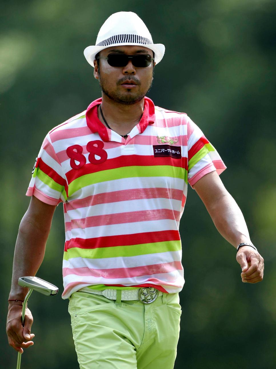
SHINGO KATAYAMA
Andrew Redington
2010
Respect is due to a man who made cowboy culture shine on the course, but this 2010 look pushes boundary-breaking style too far. Hard to hate the pants had he toned down the rest of the fit, but the polo and belt and buckle combo are too noisy. Add a hat that says “milady,” and you’ve got a bit of a mess. Thankfully, this was an outlier in an otherwise bold and beautiful aesthetic career.
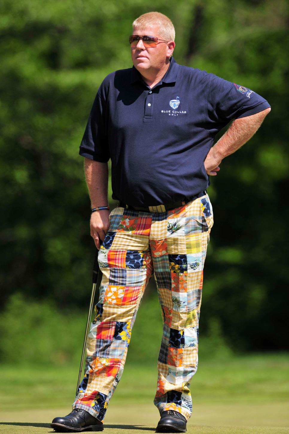
JOHN DALY
Stuart Franklin
Lifetime Achievement in Excess
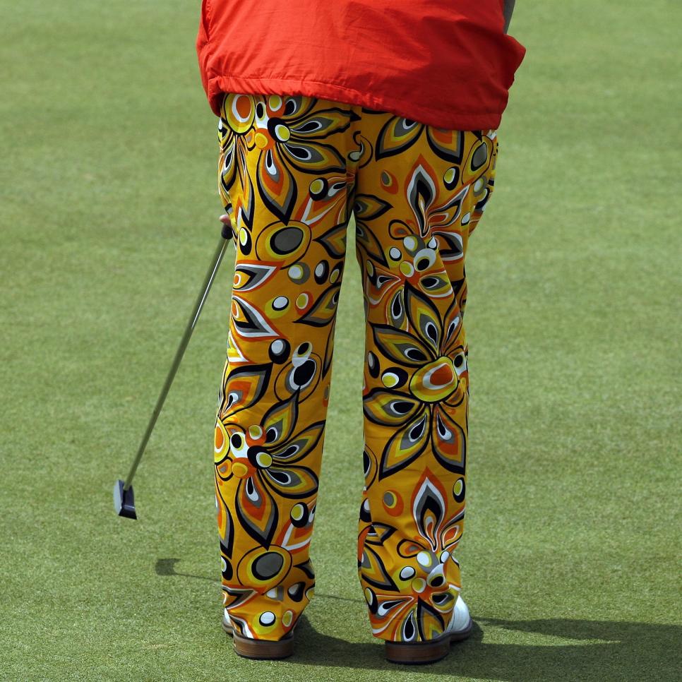
The offenses that are John Daly’s pants are more complicated than what’s screaming in your face. Surely Daly helped birth a generation of guys you love to get paired with—consuming in excess topped only by that of their trousers. That is to say, there’s charm in Daly’s brand of overindulgence, but it doesn’t excuse him from a few demerits, including but not limited to when the fabric that could have been used for several good blankets was patched into pants. Otherwise, it’s all love for Daly, who followed a key style rule in keeping the polo simple—and we think the buzz cut looks good on him.


