The Loop
This interactive golf graphic is an easy way to kill six or seven hours
Data visualization is one of those buzz terms you hear once in a while but perhaps aren't quite sure what it means. Not to worry. It's basically just a way of taking a bunch of numbers and presenting it in a more compelling way than . . . well, a bunch of numbers.
An example can be found in this cool interactive graphic by the folks at Talent Lab, which primarily deals in the world of every day business analytics, but saw an opportunity to showcase its capabilities by analyzing the best golfers in the world.
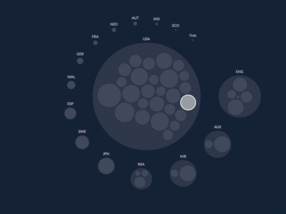
For instance, here's Talent Lab's breakdown of the nationalities of the top 50 players in the world ranking.

As you can see, the U.S. has the most players with 26, followed by England with six, South Africa with three, and then two each from Australia and Northern Ireland.
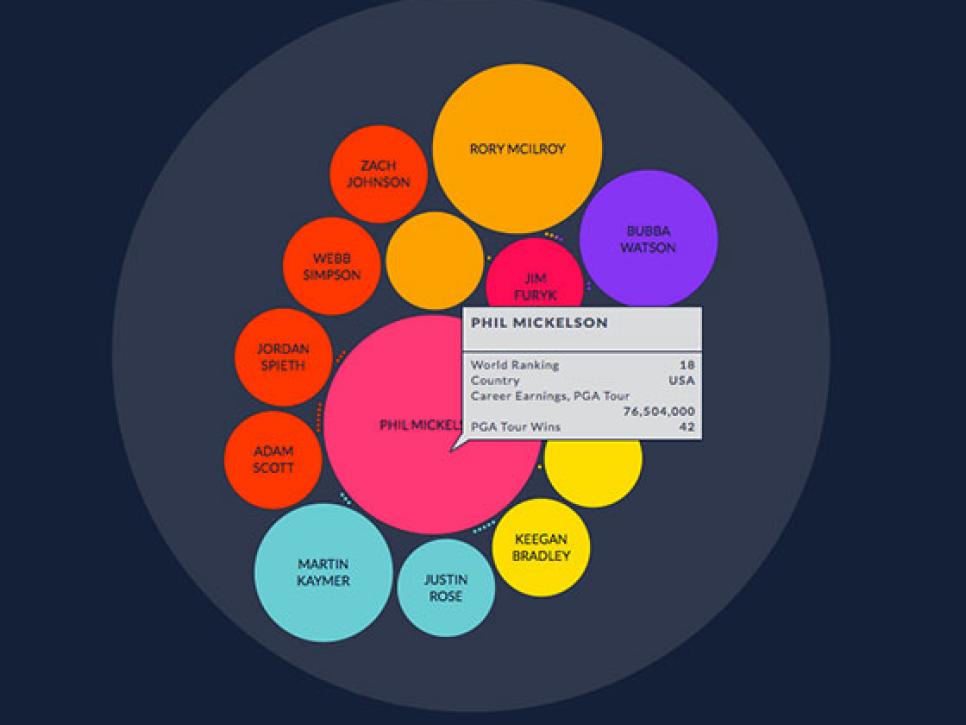
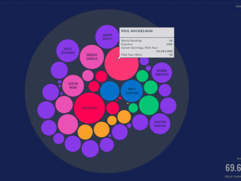
There's a lot more you can dissect. For instance there's a breakdown of the number of career wins by the top players 50 in the world.

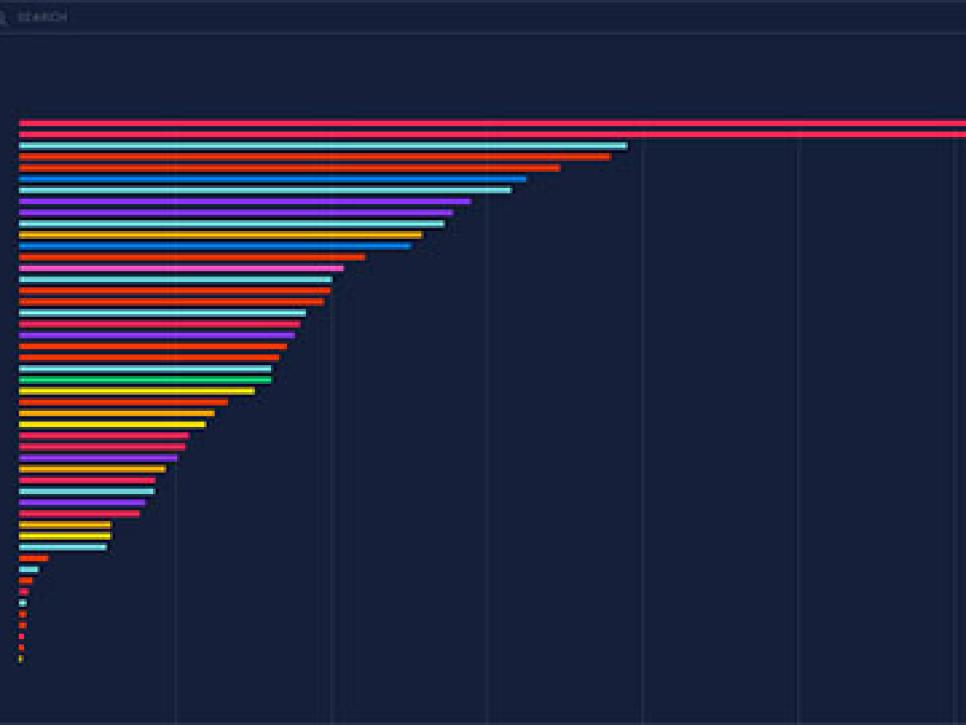
And their career earnings.

Plus, you can even sort it by which players are playing what kind of club and ball, although we should caution that sort of thing changes on an almost daily basis.

There's plenty of other stuff, so check it out. The best part about it is if your boss walks by, it actually looks like something resembling work.